

Bruno Monguzzi
ブルーノ・モングッツィ
デザイナーになったきっかけや、影響の受けた存在について教えてください。
What influenced you to become a designer? What, and who, did inspire you?
きっかけは、祖母から教えられた「エスペラント語」の存在です。私の父親は家具職人で、子ども時代には父の工房に出入りし、父が仕事で扱う古い家具、塗料、その匂いがとても好きでした。一方で、父は私を閉め出すように来客たちとドイツ語やフランス語で話しをすることがあり、そのことに疎外感を感じていました。そんな子どもを励ますために祖母が教えてくれたのが母国語の異なる人々のために開発された新しい言語です。
そうしてエスペラント語に親しんでいた私は、グラフィックデザイン=視覚言語を学ぶことを、ユニバーサルな言語を学ぶことと同様だと捉えていました。しかし、実際に教師たちが教えるのは個人的な教義ばかりで、スイスとそれを取り巻く教義やタブーから逃げ、ロンドンに移り、視覚の認知の勉強に没頭しました。そこで学んだものもまた、見せかけのビジュアルスタイルであり、メッセージや視野、受け手を無視したデザインだったと思います。
私が尊敬している人物像は、写真家のワーナー・ビショフ1です。人間的な視点をもった作家であり、愛に関する基本的な教えを受けたのかもしれません。もしあなたが愛することができなければ、本当の思いやりをもつことはできないし、物事の根底に触れることもできません。とりわけ、題材を愛することができなければ、自分の存在はなくなるし、できあがったものは共感に欠けるデザインになるでしょう。
As a child I was always hanging around my father’s workshop, I liked him a lot for the work he did, old furniture, varnishes, great smells. I always tried to get into the middle of things, but he often spoke to visitors in German and French. This probably hurt my feelings, because it cut me out of the picture. So you can understand what it meant to me when my grandmother from Rome — I would see her every summer here in Meride — spoke to me about Esperanto. For me this Esperanto seemed like a miracle, because all children could understand fathers who spoke that language. So, later on, I had the illusion that by studying graphic design I would learn the universal language.
Instead I was confronted with the private gospel of every single teacher. All my “whys” were unanswered, and for a kid in search of Esperanto this became too frustrating. I ran away from Switzerland and its dogmas and taboos, moved to London, and became very involved in the study of visual perception. It is there that I began to worry about appropriateness and relevance and that the thick skin of an allegedly brilliant student began to peel off in a slow, long process. It is surprising how radical the damage of a formalistic education can be. You learn a pseudo visual style and you ignore the message, the scope, the receiver.
The umbilical cord that links the eye to the brain, and the brain to your hand may be irreversibly cut then, before you are even born. My true model was in fact a humanistic photographer: Werner Bischof1. A fundamental lesson of love. If you do not love you are not truly attentive, you do not get to the bottom of things. But, above all, if you do not love your subject your response shows it: it betrays your absence, the absence of empathy.


モングッツィさんは世界各地で多くの賞を受賞されています。その一方で、地元の文化施設とも仕事し、教育にも深く関わっていますが、街や市民にとって文化施設のビジュアル・アイデンティティが果たす役割とは何でしょうか?
You are the winner of many prizes all over the world and the author of the famous identity for the new Musée d’Orsay in Paris, unfortunately not in use anymore. On the other hand you worked for local cultural institutions and you have been very involved in education. What is the role of the visual identity of a cultural institution in respect to the city and its citizens?
どんなビジュアル・アイデンティティであっても、その主な目的はしっかりとすぐに認識され、記憶されるイメージであることです。言い換えれば、組織に公的な「顔」を与えることがビジュアル・アイデンティティの役割です。2つの具体的なプロジェクト、ルガノ州立美術館とキアッソ市の文化アイデンティティについてお話しします。これらは、それぞれ違ったアプローチで進められました。
州立美術館は小さな公立美術館でした。「でした」と言っているのは、今は新しい名前とビジュアル・アイデンティティの別の美術館になったからです。若き館長のマヌエラ・ロッシ゠カーンからは、当初マークの作成を依頼されましたが、私はマークではなく、シンプルに組織されたロゴタイプでも機能すると考えていました。最終的には美術館がもつコレクションの歴史、時間的な長さという点を考慮し、ネオクラシカルな「A」と合理的な「M」、最小限のドットによるものを提案しました。
彼女がとても気に入ったので、そのサインに基づいてコミュニケーションコンセプトを展開させることになり、開館展のポスターではロゴを巨大なサイズで配置するなど、ロゴが中心的な要素になりました。この時点で明確なデザイン・ガイドラインは設けていませんでしたが、ポスターでは一定の余白をつくり、小さいマークを中央下部に配置するというルールを設け、各展覧会の特性を表現するための変化を受容しつつ、統一のあるフォーマットを作成しました。
キアッソの文化関連のコミュニケーションでは、ひとつの書体を軸にデザインを展開しました。アクチデンツ・グロテスクの2つのウェイト、LightとBoldです。シンプルなグリッドによるシンプルなシステムを作り、演劇のプログラムを告知するポスターを3種展開しました。異種の題材、つまり古典から実験的パフォーマンスまでを包括する4つの分野をわかりやすく見せるために基本的な「情報デザイン」のアプローチが必要でした。
このビジュアル・アイデンティティでは、各イベントの特性よりも施設そのものの個性を表すことが求められていたため、州立美術館の時とは真逆のアプローチをとりました。さらに、予算が少なく、スケジュールがタイトだったので、認識しやすく、素早く簡単に制作できることを担保するシステムに沿ったコンセプトが必要だったのです。そこで、(各パフォーマンスを表す)円形、(演劇、音楽、ダンス、映画といった各分野を表す)長方形、アイコンの大胆な気切り抜きによる変化で構成された幾何学的なシステムをつくり、硬いイメージや重複を避けながらビジュアルにリズムをつけました。
The primary scope of any corporate identity is to build a proper and immediately reco- gnizable and memorable image, in other words to give a public “face” to the institution. But in order to avoid dangerous generalizations I will talk about two specific projects: Museo Cantonale d’Arte in Lugano and the city of Chiasso cultural identity, because they present two different approaches. The Museo Cantonale was a small public art museum, I am saying “was” because it has become a different institution, with a new name and a new visual identity.
Manuela Rossi-Kahn, the very young director, had requested a mark. I explained that we could easily do without a mark and simply choose a corporate typeface, but she persisted (she had seen my M’O4), and so, considering the span of historical time of the collection, I proposed a neo-classical A, a rationalist M and a minimal dot.
She liked it a lot and I therefore decided to develop a communication concept based on that sign: on the posters the logo had to become the fundamental element. I first placed it in a giant size on the opening poster, and then I set a very strict rule: the mark — very small — would always be at the bottom, in the center, on a white field. And it would never have anything to contaminate it, within an area of safety. The only element that cannot change. Everything else can vary, even dramatically, in order to express the specificities of each show. In fact I picked a corporate typeface, but I could choose within the broad Bodoni family, and — as in the logo — with the freedom to integrate any other typefaces that would be in strict connection with the given subject matter.
For the Chiasso cultural communications I picked instead a single font — Akzidenz Grotesk in two weights, Light and Bold — and developed, for the three posters that would present the program of the theater season, a very simple system based on a simple grid. The heterogeneity of the referent — four disciplines that range from classic to experimental performances — in order to achieve visual clarity, required a substantial “information design” approach.
The visual identity relates here to the public institution rather than to the specificity of each event, the opposite approach of the one I had applied for the Museo Cantonale d’Arte. Furthermore, the small budget and the critical timing demanded a systematic concept that would guarantee immediate recognition and fast and easy production. Nevertheless, the rich play of the elementary geometric system of the disks (to present each performance), of the rectangles (to present each discipline: theater, music, dance, cinema), and the swerve of the iconic language with its radical croppings, allow visual emotion avoiding too much rigidity and redundancy.
渡英後、ミラノやヴェネチアでも活動されていたようですが、現在の拠点であるメリデに至るまでの活動についてお教えください。
How come you ended up in Meride? And tell me about the balance between your life and work and how you envision design in the future.
1961年にロンドンに渡り、学生時代にデザイナーのデニス・ベイリーと建築家のアラン・アーバインのための印刷プロジェクトに参加しました。それを期にミラノで写真家のアントニオ・ボッジェーリ2のスタジオ、Studio Boggeri3に参加し、その後ヴェネツィアのCini財団で活版印刷のデザインを教えるようになりました。65-67年には67年のモントリオール万博のパビリオンデザインを担当するこになりカナダに渡りましたが、仕事を終えた後、デザイナーでアーティストのシャルル・ギャニオンにモントリオールに残ることを打診され、移住を検討したこともありました。しかし、カナダの社会システムへの疑問などもあり、再びミラノのStudio Boggeriで10年以上にわたりフリーランサーとしてコラボレーションを行いました。
1984年に携わったオルセー美術館のアイデンティティや1989年のスイス・フランの新紙幣のデザインなど様々な企業や文化施設の仕事に携わってきましたが、イタリア・スイスの両国で出版社や新聞社の印刷基準の設定に関わったり、ルガノやメンドリシオの大学でゲシュタルト心理学や視覚コミュニケーションの授業を受けもつなど、長年教育活動にも携わってきました。
現在暮らすメリデに拠点を構えたのは1971年のことです。山奥の小さな村ですが、拠点をここに起き、国内外の様々なプロジェクトに関わって来ました。
I needed silence. At the end of my work for Expo 67 in Montreal Charles Gagnon had asked me stay on. But after working the previous months without any break I needed to get away. I wanted to spend the summer in Mexico, and then we would discuss everything in September. When I returned, going through Canadian customs I felt a violent reaction of rejection. As if an immediate, explicit physical message had caught me unaware. A gesture, a word, a hug can change us. During that whole summer — immersed as I was in that culture, so distant from North America — I never thought, not even for an instant, about Montreal, my work, my tomorrow. And now I felt like I did not belong there in Canada. I had to listen to myself. Charles understood. As the sole passenger, I began to listen to myself aboard the slowest, smallest merchant ship that crossed the Atlantic in those days.
Now: life and work. As Dieter Bachmann once wrote I am “a lucky person”. To design, to teach, is my life. And, I must admit, I have never learned to work: I have just followed my passions. What I know about the future is that technology will obviously continue to change, and that our fundamental responsibilities — toward the person that has decided to put a problem in our hands, towards the person we are addressing, and towards the environment — will always be there.

Querschnitt
Werner Bischof, 1961

Portrait of Antonio Boggeri
Ugo Mulas, 1961

Lo Studio Boggeri 1933–1981, 1983
仕事と生活のバランス、未来のデザインに関するお考えについてお教えください
カルチャー誌『DU』の元ディレクターでジャーナリストのディーター・バックマンは、私について「ラッキーな人」だと語ったことがあります。彼の言う通りで、デザインし、教えることが私の生活です。さらに、仕事をすることを学んだことはなく、ただ自身の情熱に従っただけと認めざるを得ません。未来についテクノロジーが変化し続けることは明らかであり、重要な責任、つまり問題を私たちに委ねる人の責任、訴えかける人の責任、環境に対する責任が常に伴うでしょう。
Works


Les Noces. Oskar Schlemmer, Igor Strawinsky, Poster, 1987
Florence Henri, Photographs 1927-1938. Lucia Moholy, Bauhaus Portraits, Poster, 1991
Les Noces. Oskar Schlemmer, Igor Strawinsky, Poster, 1987
Florence Henri, Photographs 1927-1938. Lucia Moholy, Bauhaus Portraits, Poster, 1991

Fausto Melotti. Melotti and Mulas, Photographs
Fausto Melotti. Melotti and Mulas, Photographs
Poster, 1991
Poster, 1991

Permanent Collection XIXth and XXth century
Permanent Collection XIXth and XXth century
Poster, 1999
Poster, 1999

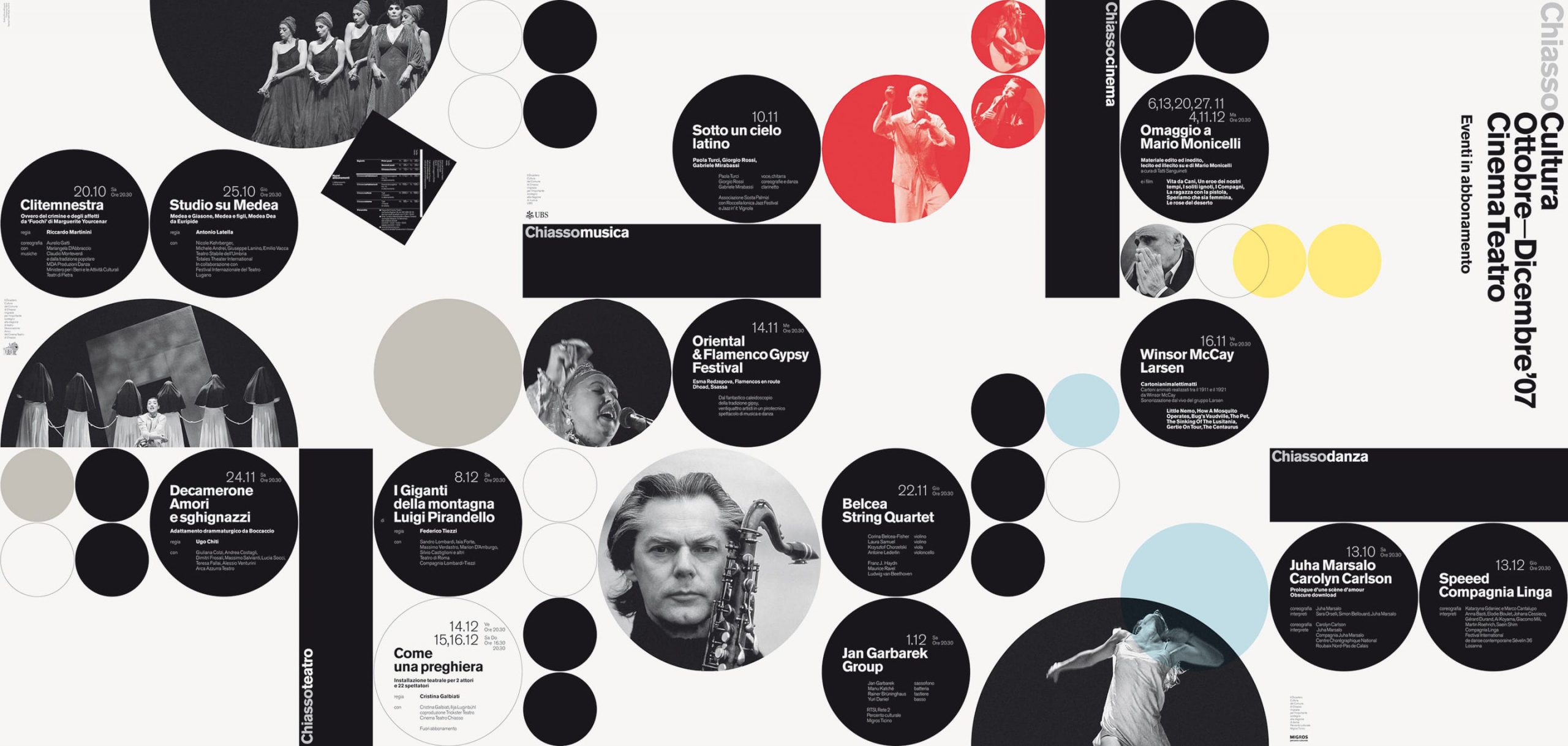
City of Chiasso cultural identity
City of Chiasso cultural identity
Visual identity, 2002–09
Visual identity, 2002–09