

Swiss Typefaces
スイス・タイプフェイシズ
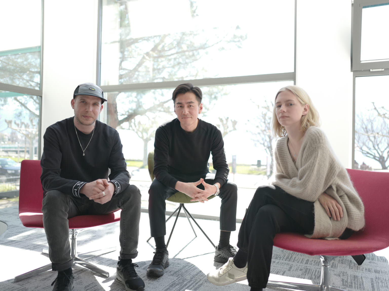
簡単に自己紹介をお願いします。
Could you please tell me a little bit about yourself?
エマヌエル・レイ(以下ER): 私がSwiss Typefacesの代表でデザインヘッドを務めています。2006年に会社をヴヴェイで設立しました。
オセアヌ・トルティ(以下OT): 私はグラフィックデザインとコミュニケーション全般を担当しています。
ER: チームの中核をなすメンバーには、マネージングパートナーのマキシム・プレシャ=ブシ、アシスタントディレクターのノエミ・ストゥベル、シニアタイプデザイナーのコンタン・シュマベールがいます。他にも、フォントエンジニアリング、コピーライティングや庶務の才能ある外部スタッフと連携して仕事をしています。
Emmanuel Rey (ER): I’m Managing Partner and Head of Design at Swiss Typefaces. The company was created back in 2006 and we are based in Vevey.
Océane Torti (OT): I’m in charge of Graphic Design and Communication.
ER: The core team also includes Maxime Plescia-Buchi, Managing Partner; Noémie Stuber, who’s Assistant Director; Quentin Schmerber, Senior Type Designer. And additionally, we’re working closely with a few talented contractors for font engineering,
copy-writing and administrative stuff.
タイポグラファを目指されたきっかけは何だったのでしょうか? 仕事や人生で影響を受けたものについてお教えください。
What influenced you to become a typographer? What inspires you in your work and life?
ER: 子どもの頃から古いカリグラフィの本にずっと魅了されていました。10代になると、壁や電車にグラフィティ1を描くようになりました。科学系の学校に2年行ったものの中退し、文字を書くという自分の天職に進むことにしました。この時期、ECALでグラフィックデザインを学び始めました。
OT: 私はグラフィックデザイナーですが、この職業に就いたきっかけは、誰かのメッセージやアイデアを世に出すにはどうやって物事が繋がったり、コミュニケーションしたりするのか知りたいという好奇心からでした。写真にはじまって映像、舞台、ダンス、絵画などアート全般に魅了されてきましたが、様々なアートの形態からひとつ選んで突き進むことができずにいました。しかし、グラフィックデザインの中には自分の興味の対象がちょうど良く融合していることに気づき、ローザンヌでグラフィックデザインとコミュニケーションを学ぶことにしました。
ER: Since I was a child, I’ve always been interested in old calligraphy books. Later as a teenager, I was involved in the graffiti scene1, painting walls and trains. After loosing two years at a science school I decided to leave and pursue my mission: to draw letters. I started to study graphic design at ECAL at this time.
OT: I’m a graphic designer, but what brought me to this profession is my curiosity to understand how things connect and communicate together to bring out someone’s message/idea. Also, I’ve always been interested in art in all its forms, jumping from photography, to video, theater, dance, drawing, etc. As I couldn’t choose one of these forms of art and stick to it, I found out that graphic design was a perfect mix of a lot of things I loved. I studied graphic design and communication in Lausanne.
『Type Life』という名の雑誌を発行されています。何か特別な意味があるのでしょうか?
You publish the magazine Type Life. Does this name have any particular meaning?
ER: ラッパーの2Pacがいた「Thug Life」2というグループ名にちなんでいます。
ER: Yes, it was inspired by Thug Life2, from Tupac Shakur.

Photos of grafiti taken by Emmanuel Rey
in Berlin

Thug Life: Vol. 1, Thug Life
Record, 1994
最近のお仕事をお教えください。
What are your recent projects?
OT: Raskal Onerという新しい書体を2019年末か2020年初頭に発売予定です。この書体は2015年からSwiss Typefacesの研究開発部門によって制作されたLABフォントと呼ばれるシリーズの一部で、デジタル時代のスクリプトフォントの意味や可能性を探求するプロジェクトでした。
手書きの美しさの追求に加え、等幅フォントも考案したんです!手書きの等幅フォントを見たことがあるでしょうか?そもそも、手書きの等幅フォントをデザインすることは理にかなっているのでしょうか?Raskal Onerはタイプデザインの研究開発の良い事例となりました。今日のタイプデザインにおけるクリエイティビティを問いかけるだけでなく、新しいアイデアと美学を引き出すために、今後もLABフォントの開発に取り組んでいきたいと思っています。
ER: Raskal Oner is one of our next releases for our Wild Style (LAB) catalog. It’s been under development since 2015, and its release is planned for late 2019 or early 2020. Raskal is Swiss Typefaces’ take on script fonts. “What’s the interest in taking old hand drawn styles to the digital era of types?” “What does it mean to have a script font (all letters connected/handwriting style) on a computer?” “Do we need to mimic handwriting? Or should we look for new visual solutions when designing on computer?” Raskal’s design was strongly motivated by researches around these topics. As it’s part of our Wild Style (LAB) catalog, we tried to push the concept as far as possible.
Beside the script aesthetic exploration, we also came up with a monospace font! Did you ever see a monospaced script font? Does it even make sense to design one?
Raskal Oner is a good example of Research & Development in type design, and this is what we want to achieve with our LAB fonts: they are prototypes, and their role is to provoke new ideas and aesthetics, as well as to interrogate creativity in type design today.


スイスのデザイナーの新世代のひとりとして、スイスのヴィジュアルコミュニケーションデザインの新しい方向性を世界に提示しようとしているという印象があります。あなたの世代のデザインとこれまでのデザインの違いをどのように捉えていますか?
I got the impression that you, as one of the new generation of Swiss designers, are trying to present a new way of Swiss visual communication design to the world. How do you capture the differences between the design of your generation and that of a few generations ago?
ER: 何か新しいことを提示しようとしているかどうかはわかりません。スイスには、グラフィックとタイプデザインのとても強固なバックグラウンドがあります。それは私たちの文化の一部ですし、その中で育ってきたわけです。人々のブログで見るスイススタイルのデザインの中で生きていますし、とても身近なものであり、DNAの一部と言えます。
何世代か前、つまりデジタル時代の前は、全てが今よりずっと閉ざされていました。インターネットはないし、興味を駆り立てるデザインブログもないし、デザインの学校も少ないし、デザイナーやデザイン学生になる傾向も少なかった。現在、スイスで生まれるデザインは、他の文化やヴィジュアル資料に影響を受けています。アートスクールはブランド企業のように世界中から講師が集まり、Googleが新しい図書館で、模倣者が溢れています。
私たちの世代は明らかに何にでも影響を受けてきたので、スイススタイルについて語るのは難しいと思います。私たちが知っている伝統的なスイススタイルを手掛けるのは、ほとんどの場合はスイス人ではないグラフィックデザイナーなのではないでしょうか。つまり、その時代にこだわりを見出し、スイスデザインを研究して複製している人たちです。個人的にはこうした制作方法に何の興味もありませんし、おそらくほとんどのスイスのデザイナーが同じような考えだと思います。スイスのデザインシーンで、自分たち自身のスタイルが認識され、貢献することを熱望していますが、上の世代がとても上手に作ったものや、70年代のスイスのヴィジュアルに戻すようなデザインを作ることには興味がないんです。
OT: 使っているツールが違うということもあると思います。現在は、印刷でもスクリーン上でも、色、形、メディアの可能性が無限にあります。ひとつの題材に対してかなり素早く、いろいろなことを試すことができます。(スイスの)デザイナーとして、昔の(スイスの)デザイナーより深く、より遠くに追求してみたくなるのではないでしょうか。自分に正直であれば、より良いものを作りたい、他の人を超えたいという意思を自然ともつものだと思います。競争やイベントを生み出し、人と各業界を結びつけることで、デザイン業界が注目されることになるので、良いことだと思います。
ER: I’m not sure there is an attempt to try to present something new. In Switzerland, we have a very strong background in graphic and type design. It’s part of our culture. We grew with it. The design you see on blogs about Swiss style, we live in it, it’s easy for us, it’s part of our DNA.
A few generations earlier, before the digital era, everything was much more confidential: no Internet, no inspirational design blogs, less design schools, less trends around being a designer/design student. Today, the design produced in Switzerland is influenced by the accessibility to other cultures and visual assets. Art schools are more like branding companies, teachers come from around the world, Google is the new library, and there are copycats everywhere.
Our generation has clearly taken influences from everywhere, and it’s more difficult to talk about a Swiss style. I guess, traditional Swiss style as we know it is now better executed by (mostly) non-Swiss graphic designers who are obsessed by this period in time, studied it and now are duplicating it. Personally, I do not see any interest in this way of making, and I guess it’s the same for the majority of Swiss designers: we’re hungry to be recognized for our own style and contribution to the Swiss design scene, but have no interest in making what our elders were making very well, or making designs bringing our country visually back to the 70’s.
OT: I guess the tools are different too. The possibilities for colors, shapes, media are infinite now, for both print and screen. You can also create very quickly and try a lot of different things in a small amount of time. And with all the exposure that everything gets on the social medias, there’s a lot of comparisons too. I think there’s a will to ever surpass oneself and probably others if you’re 100% honest! As a (Swiss) designer, you always want to go deeper, further than the (Swiss) designer before! But that’s great because it pushes the design industry into the spotlight by creating competitions, events, connections between people and industries.
大企業向けのブランディングを依頼されることがありながらも、デザイン業務には関わらないというポリシーをおもちだと伺いました。その理由はなぜでしょうか。
You told me that you have a policy not to be engaged in any design work, despite the fact that you have had a request to take on a branding project for a major corporation. Why?
ER: 私たちはタイプデザインエージェンシーです。会社にある全てのものはタイプデザインのサービスを提供するために最適化されています。ブランディングは全く異なる職種です。タイプデザインが、単にヴィジュアルコミュニケーションの一部というだけでなく、それ自体が専門分野だということを多くの人は忘れがちなのかもしれませんね。でも、ブランディングプロジェクトに参加することは好きです。タイプデザインの専門家としての技能を、もっとグローバルな仕事や外部のブランディングエージェンシーのために活かせるからです。こうしたコラボレーションは定期的に行っています。
加えて、Swiss Typefacesや、私たちの書体Sang Bleuの世界観を求めている企業にインハウスデザインを提供するために、グラフィックデザインに特化したSang Bleu Semanticsという姉妹会社があります。Swiss TypefacesとSemanticsは、様々な分野で高度な技能を必要とするプロジェクトで両者が密接に仕事をしています。
ER: Swiss Typefaces is a type design agency. Everything in our company was built to provide type design services at their best. Branding
is a totally different professional activity. Maybe people tend to forget that type design is a discipline in itself, not just a part of visual communication.
But we love taking part in branding projects, bringing with us our expertise as type design specialists with more global work and with external branding agencies. We regularly have these kind of collaborations.
In addition, to offer a complete in-house design service for those wanting a snippet of the Swiss Typefaces/Sang Bleu universes, we have our sister company, Sang Bleu Semantics, which specializes in graphic design among other areas in the visual and cultural fields. Both
companies, Swiss Typefaces and Semantics, work very closely on some projects requiring multiple high-end competencies across various fields.
未来における書体デザインの役割はどうなるとお考えでしょうか。
What do you think the role of typeface design will be in the future?
ER: 忘れられがちなのですが、グラフィックデザインの第一の役割は、顧客に向けて、何かをはっきり見せる、コミュニケーションする、売るのいずれかです。タイプデザインはグラフィックデザイナーが仕事に使うものであり、この先も変わらないでしょう。一方で、文字を読む習慣は環境の進化により変化していきます。それに対し、タイプデザイナーは書体デザインという方法で新しい答えを提案していく必要があると思います。
文字を読む習慣は技術の進化により変化していきます。それに対して、タイプデザイナーは書体デザインという方法で新しい答えを提案していく必要があると思います。
もうひとつのタイプデザインの役割は、自分たちの時代の美的価値の形成に関わることです。これはおそらくあまり認識されていない点かもしれませんが、私にとって書体をデザインする主な魅力はここにあります。音楽、ファッション、プロダクトデザイン等と同様に、私たちが聞いたり着たりするものは50年、100年、1000年前と同じではありません。グラフィックデザインは、私たちが生きる時代と社会と共に発展しています。フォロワーになるのか、現在の流行に乗るのか、あるいは野心があればリーダーになれます。
書体を見れば、デザインされた時代がわかるはずです。その時代のヴィジョンと作った人たちの考えを通した美的価値観が伝わってくるはずです。時代遅れに見せたいという特別な理由がない限り、私には今の時代に合わないものをデザインする意味は見いだせません。
ER: People tend to forget it, but the first role of graphic design is to display or communicate or sell something to an audience. Type design is here to help graphic designers in their task and this will not change. There are all these technological changes, and also reading habits that will have to be adjusted to by type designers.
Another role of type design is to participate in shaping the aesthetic of our time. This is probably less considered, but this is my main interest in designing typefaces. Like for music, fashion, product design, etc., what we listen to or wear is not the same as 50, 100 or 1000 years ago. Graphic design is evolving with our time and the society we live in. Then, you can choose to be a follower, and to stick to the current trends, or if you have that ambition, you can be a leader.
Looking at a typeface, you should be able to tell when it was designed. And it should give you a vision of that time and the aesthetic concerns that were going through the minds of creative people. I cannot understand the goal of designing something that does not fit our time, unless it has the specific purpose of looking outdated.
Works


Type Life Magazine
Type Life Magazine
Magazine, 2017–present
Magazine, 2017–present


Market Sans: eBay Corporate Typeface
Market Sans: eBay Corporate Typeface
Exclusive typeface, 2017–2018
Exclusive typeface, 2017–2018

